Case Studies

    Projects, in detail

    Every project below is live and open to visit. For each one we explain the brief, the problem we had to solve, the strategy we chose and what we actually shipped — so you can judge the work, not a slogan. We work with clients across Switzerland, remotely and on site.

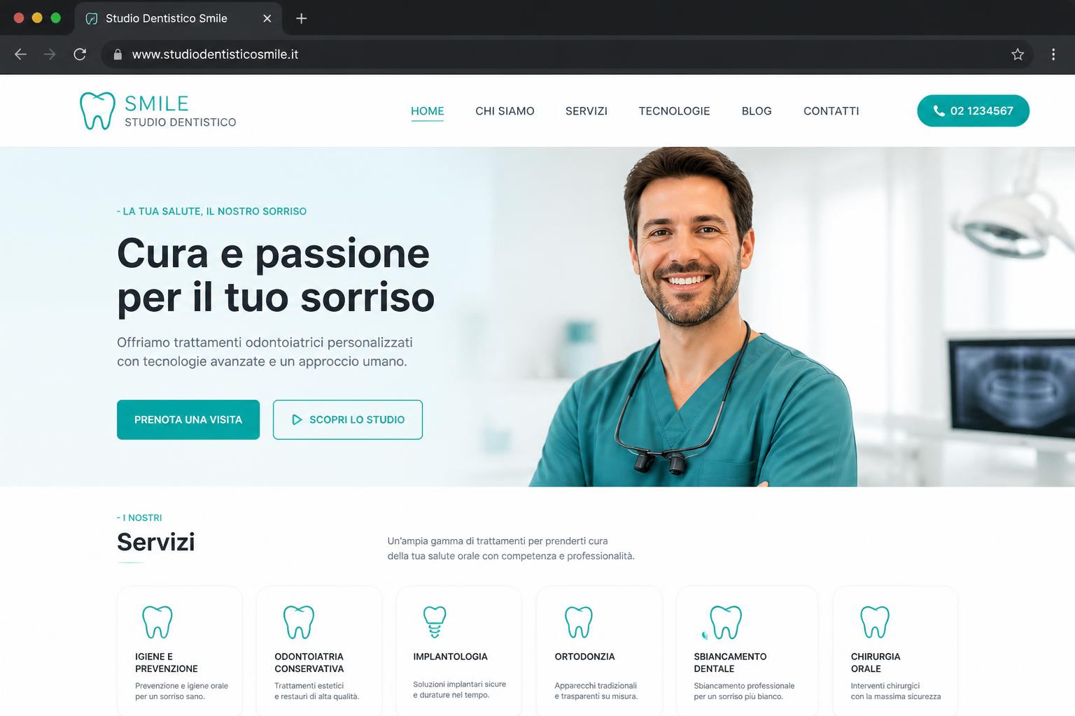
    Studio Dentistico

    Studio Dentistico Smile

    The brief

    A dental practice site that has to reassure a nervous visitor and turn them into a booked appointment, not just list treatments.

    The problem

    Dental websites usually read like a price list. The visitor cannot tell who will treat them, how the first visit works, or how to book without calling during office hours.

    Our strategy

    Lead with trust signals — team, clinic, treatment explained in plain language — then place a booking action within reach at every scroll depth. Structure each treatment as its own indexable section so the site can rank for treatment-level searches, not only the practice name.

    What we shipped

    • Treatment pages written in plain language, each one an indexable section
    • Booking call-to-action repeated at every scroll depth, mobile-first
    • Team and clinic presentation used as the trust anchor above the fold
    • Semantic headings, image alt text and metadata set per page
    Visit site

    Parrucchiere

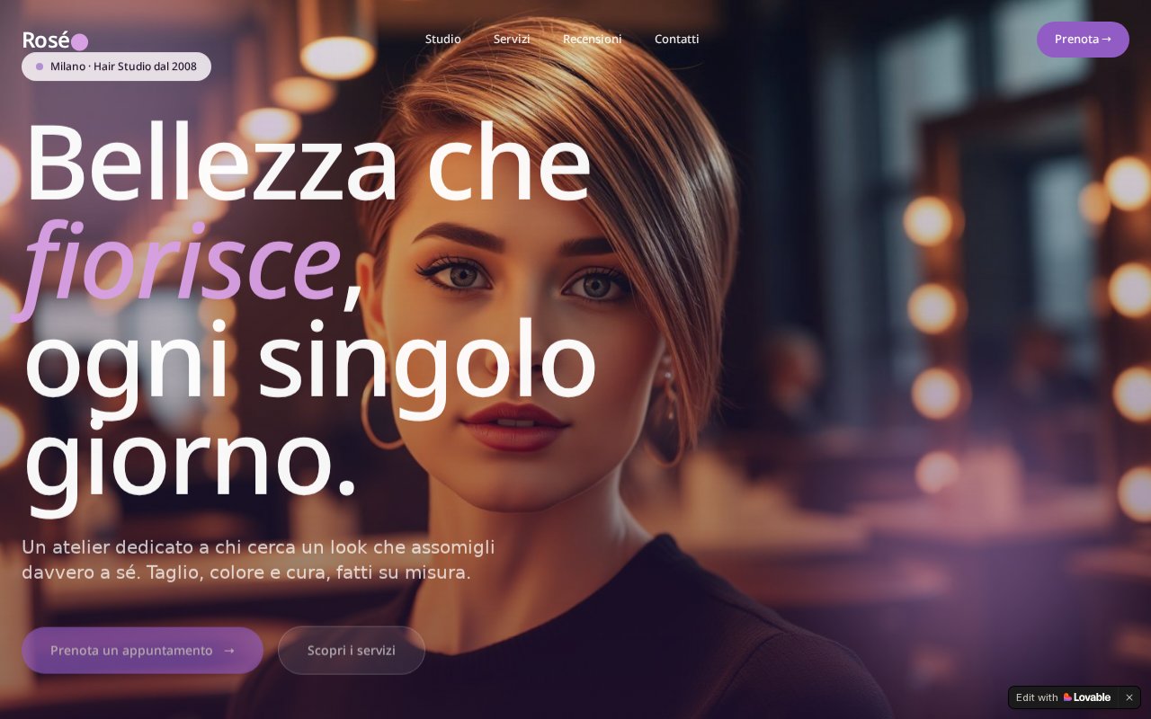
    Rosé Hair Studio

    The brief

    A hair salon that wanted its website to feel like the salon: visual, current, and able to take bookings without a phone call.

    The problem

    The salon's presence lived on social media. Nothing was indexable, nothing was owned, and a first-time client had no way to see the work and book in the same place.

    Our strategy

    Make the portfolio of work the core of the site instead of an afterthought, and pair it with an immediate booking path. Own the content on a domain the salon controls, then use social as the entry point rather than the destination.

    What we shipped

    • Visual-first layout with the salon's work as the main content
    • Booking flow reachable from every section
    • Service and price presentation structured for search
    • Responsive build tuned for mobile, where salon traffic actually arrives
    Visit site

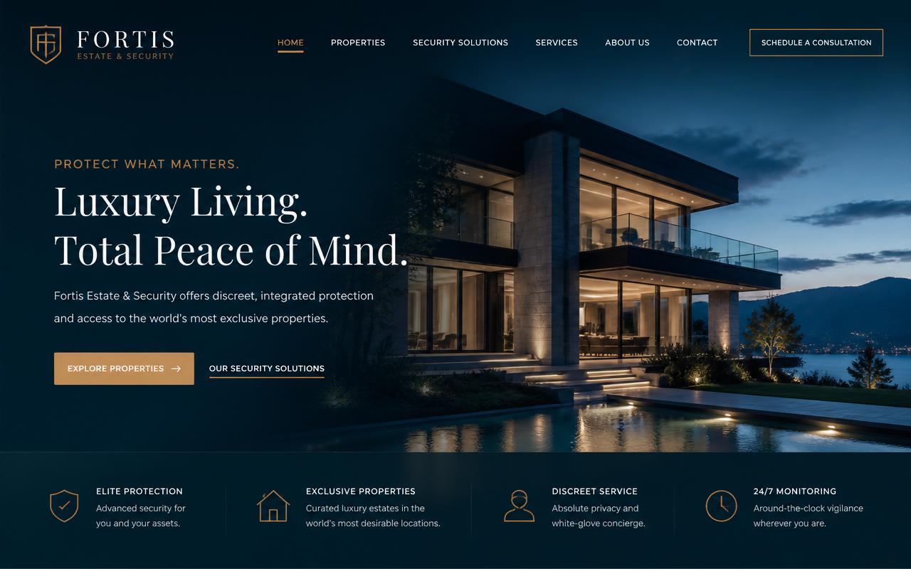
    Luxury Real Estate & Security

    Fortis Estate & Security

    The brief

    A luxury real estate and security brand addressing a small, high-value audience that judges credibility in seconds.

    The problem

    Two very different offers — property and security — under one brand. Presented together without hierarchy they weaken each other, and the premium positioning collapses into a generic services page.

    Our strategy

    Separate the two offers into distinct narrative tracks with a shared visual identity, and slow the page down: generous spacing, restrained typography, few but deliberate calls to action. Discretion is the conversion argument for this audience.

    What we shipped

    • Two clearly separated service tracks under one identity
    • Editorial layout with restrained typography and deliberate pacing
    • Qualified enquiry form instead of a generic contact box
    • Metadata and structure aligned to the premium positioning
    Visit site

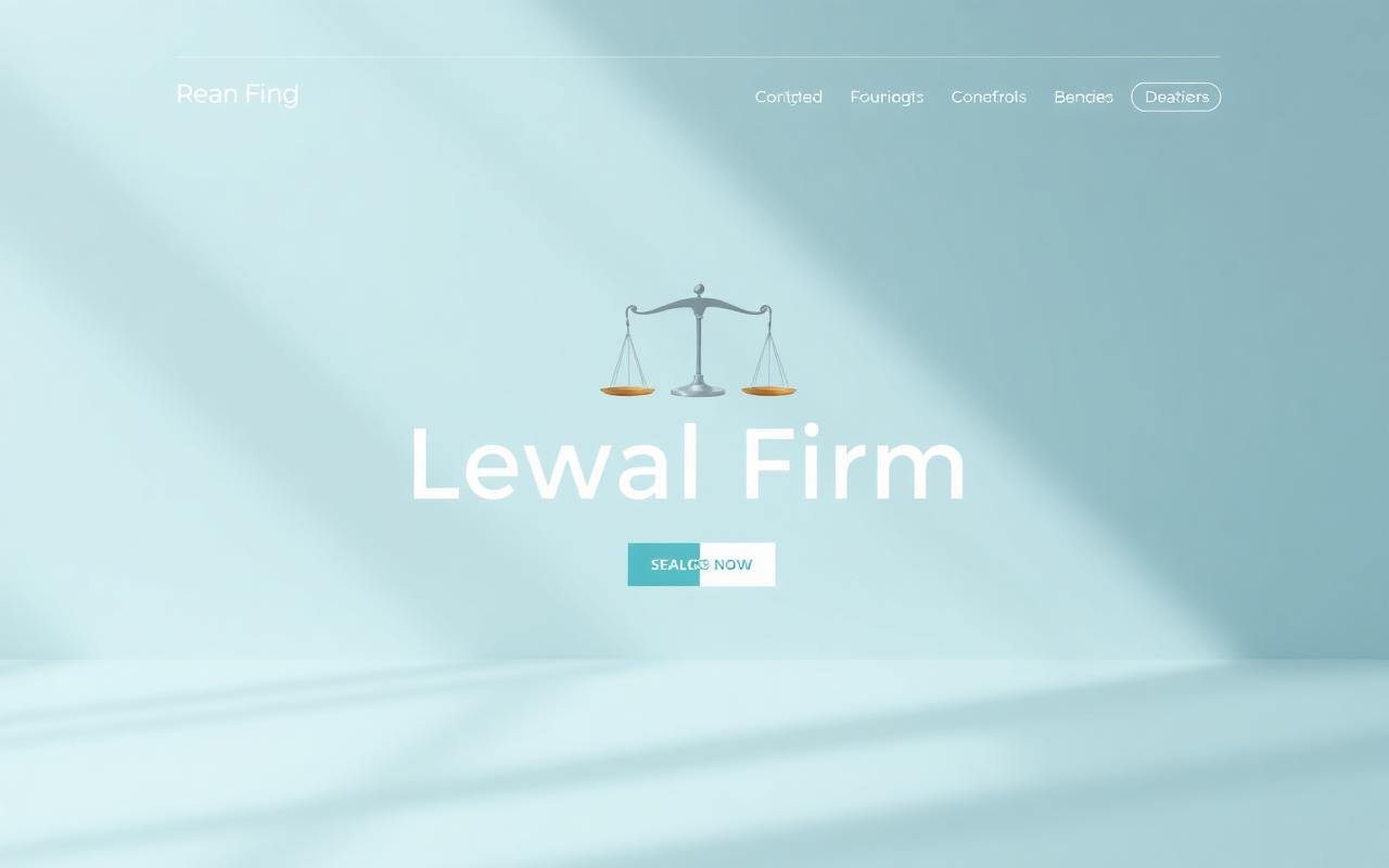
    Avvocati / Legal Tech

    Studio Legale Svizzera

    The brief

    A Swiss law firm site that has to convey competence and confidentiality while still being findable for practice-area searches.

    The problem

    Legal websites default to dense institutional prose. A prospective client cannot quickly identify whether the firm handles their specific matter, and the site ranks for nothing but the firm's own name.

    Our strategy

    Give each practice area its own clearly labelled section written from the client's question rather than the firm's expertise, and keep the first contact low-friction and confidential. Structure the site so practice-area terms have somewhere to land.

    What we shipped

    • Practice areas structured as separate, indexable sections
    • Copy written from the client's question, not the firm's résumé
    • Discreet, low-friction contact path
    • Clean semantic structure and per-section metadata
    Visit site

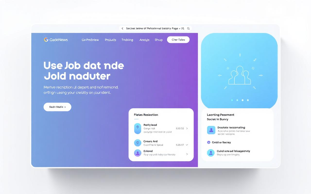
    Recruitment

    Swiss Legal Career

    The brief

    A recruitment listing that had to compete for attention on a job board where every posting looks the same.

    The problem

    On an aggregator, formatting and clarity are the only levers left: the employer brand, the role and the reason to apply have to survive being read on a phone in under a minute.

    Our strategy

    Rewrite the listing around what a candidate actually decides on — role, context, what the first months look like — and structure it so the aggregator's own search surfaces it for the right queries.

    What we shipped

    • Listing restructured around candidate decision criteria
    • Keyword-aware wording aligned to how candidates search on the platform
    • Scannable formatting built for mobile reading
    Visit site

    These are projects we designed and built. We publish the scope and the deliverables rather than performance numbers, because traffic and conversion data belong to our clients and we do not publish figures we cannot show you the source of.

    Want a project like these?

    Start your project